XCOPRI
OVErVIEW
At Calcium and Company, I led the redesign of XCOPRI’s HCP website and interactive visual aid for sales representatives. XCOPRI is a medication used to treat partial-onset seizures in adults. I developed a new visual language for doctors that aligned with the updated patient-facing branding while giving the HCP system its own professional tone. The refreshed design now guides assets across the HCP brand.
ROLES
•UX/UI Designer
•Brand Designer
my team
Maya Williams
tools
•Adobe Creative Cloud
•Figma
duration
10 weeks

XCOPRI
At Calcium and Company, I led the redesign of XCOPRI’s interactive visual aid (IVA) for sales representatives, which informed the brand’s HCP (Healthcare Professional) website and other assets. I developed a refreshed visual language aligning HCP materials with patient-facing branding while maintaining a professional tone. This system now guides HCP brand standards across digital and print assets. I also designed a PowerPoint template for HCP use.
ROLES
•UI/UX Designer
•Design Lead
my team
tools
•Adobe After Effects
•Adobe Illustrator
•Adobe Photoshop
•Figma
duration
•2 months
Project Development
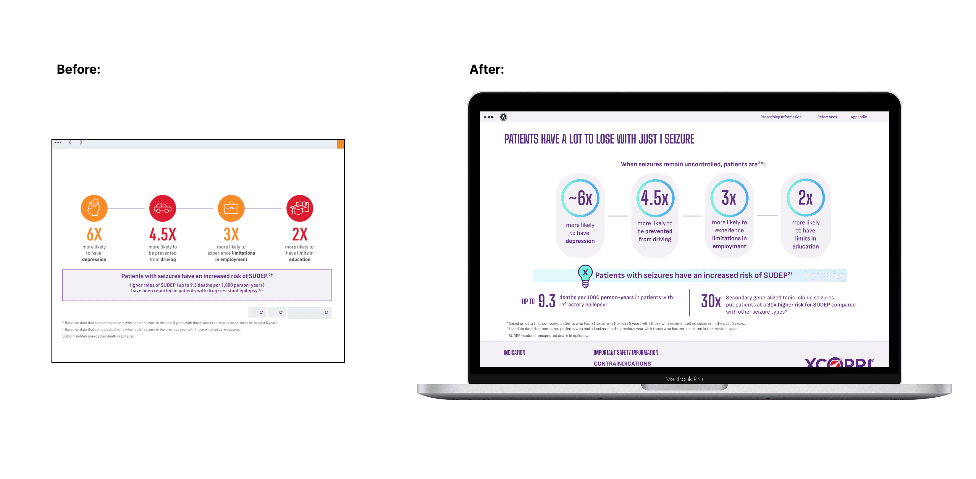
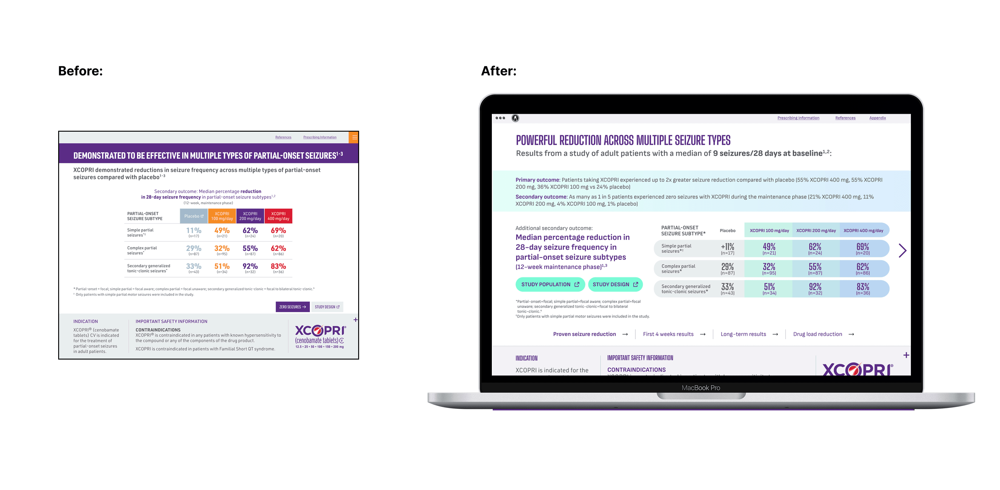
As a team, we selected three key IVA pages from the existing design to redefine the new visual language. Three designers created distinct look-and-feel directions, and the client chose my design to lead the redesign, along with icon assets from another designer. From there, I co-led client feedback and refinement alongside Joe Gugliuzza, ensuring the new system was cohesive and adaptable across platforms.
As a team, we selected three key IVA pages from the existing design to redefine the new visual language. Three designers created distinct look-and-feel directions, and the client chose my design to lead the redesign, along with icon assets from another designer. From there, I co-led client feedback and refinement alongside Joe Gugliuzza, ensuring the new system was cohesive and adaptable across platforms.
Incorporating Feedback
In the initial client feedback, the team responded positively to the light purple accent in my layout and the gradient ring icon used to emphasize key information. However, they wanted an alternative method for highlighting content more consistently. Based on that feedback, I introduced a gradient lowered-opacity bar to call attention to important details while maintaining a clean and cohesive layout.
In the initial client feedback, the team responded positively to the light purple accent in my layout and the gradient ring icon used to emphasize key information. However, they wanted an alternative method for highlighting content more consistently. Based on that feedback, I introduced a gradient lowered-opacity bar to call attention to important details while maintaining a clean and cohesive layout.
PROJECT REDESIGN

POWERPOINT TEMPLATE – VERSION 1
POWER POINT TEMPLATE DESIGN
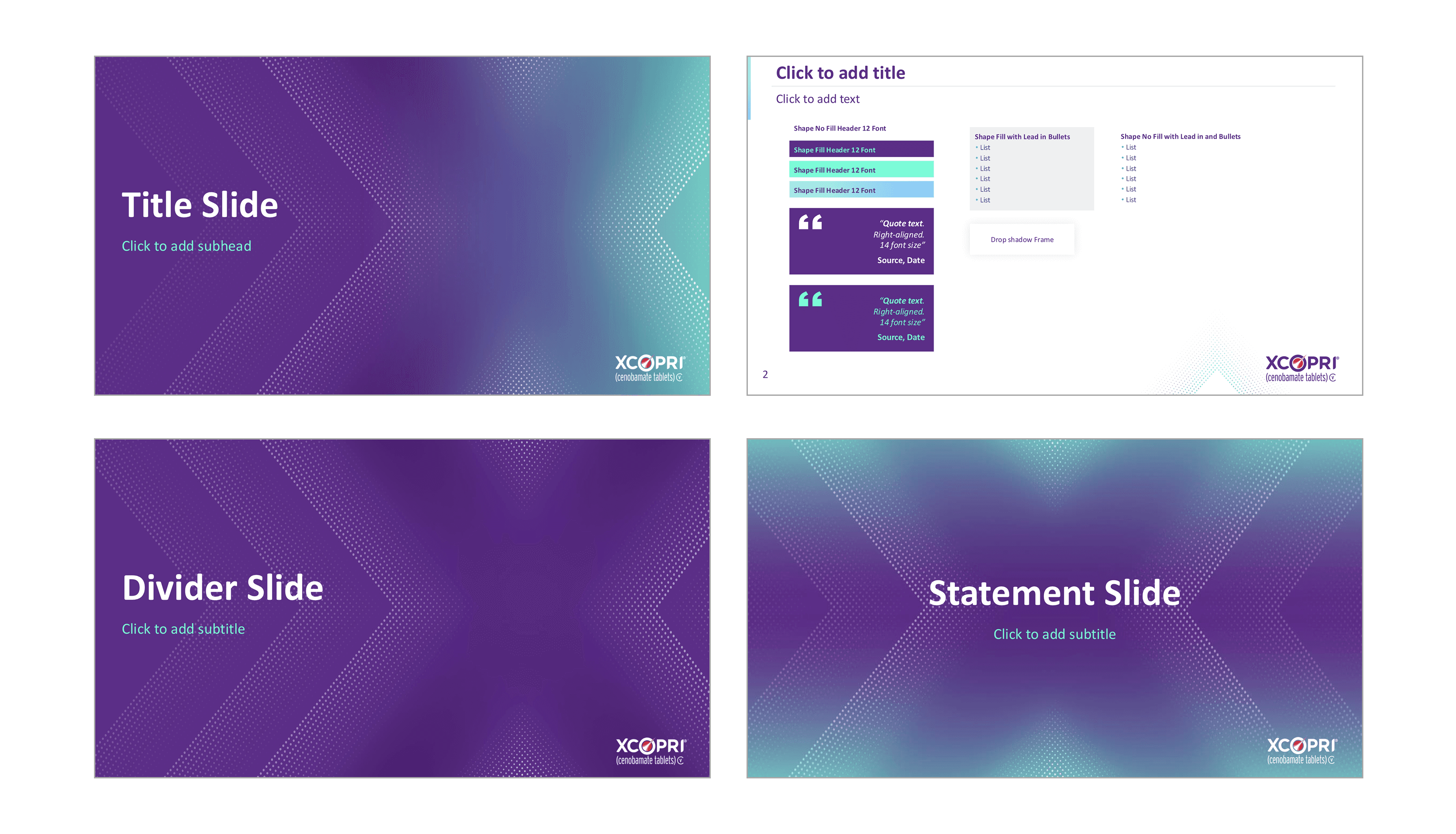
In addition to the IVA assets, I created a PowerPoint template for XCOPRI’s HCP internal use, incorporating a halftone dot texture to form an "X". Working closely with my creative director, Kein Ziemkiewicz, I refined the design based on the client feedback. Below is my initial design—the client requested reducing the texture, toning down the aqua color, and placing greater emphasis on the "X" created by the dots.
In addition to the IVA assets, I created a PowerPoint template for XCOPRI’s HCP internal use, incorporating a halftone dot texture to form an "X". Working closely with my creative director, Kein Ziemkiewicz, I refined the design based on the client feedback. Below is my initial design—the client requested reducing the texture, toning down the aqua color, and placing greater emphasis on the "X" created by the dots.

FINAL POWER POINT TEMPLATE DESIGN
FINAL POWER POINT
TEMPLATE DESIGN
POWER POINT TEMPLATE DESIGN
Below is the final PowerPoint design, featuring reduced aqua tones and texture, along with an added overlay layer to further emphasize and make the “X” more prominent.
Below is the final PowerPoint design, featuring reduced aqua tones and texture, along with an added overlay layer to further emphasize and make the “X” more prominent.
XCOPRI BRAND BOOK
POWER POINT TEMPLATE DESIGN
Below, I highlighted the official HCP brand book pages that I helped influence as part of developing the brand’s updated look and feel.
Below, I highlighted the official HCP brand book pages that I helped influence as part of developing the brand’s updated look and feel.

TAKEAWAYS
This project was my first experience designing in a real-world agency setting, where I learned how to interpret and incorporate client feedback effectively. I also gained valuable experience in communicating a cohesive design system to other designers, ensuring the visual language remained consistent across all pages, graphs, and assets.
This project was my first experience designing in a real-world agency setting, where I learned how to interpret and incorporate client feedback effectively. I also gained valuable experience in communicating a cohesive design system to other designers, ensuring the visual language remained consistent across all pages, graphs, and assets.


ROCK SCHOOL OF DANCE

Enter Password

XCOPRI
At Calcium and Company, I led the redesign of XCOPRI’s interactive visual aid. XCOPRI is a medication for treating partial-onset seizures in adults. I developed a refreshed visual language for doctors that aligned with the updated patient branding while creating a distinct, professional tone now used across all HCP materials and brand guidelines.
Deliverables: Sizzle Reel, App Design, Brand System
Duration: 10 weeks