MIXOLOGY

OVErVIEW


In my Environmental Design course, we were tasked with creating a wayfinding system for a well-known brand or collaboration, and my group chose the Nike × Wu-Tang Dunk release. We embraced the “Killa Bees” theme — drawing from the collab’s black-and-pollen yellow palette and its hip-hop roots — to translate the sneaker’s energy into environmental graphics. I designed the project’s logo and color palette, and introduced the hexagon motif as a nod to the bees, which became a key visual element across the system, including one of the primary event signs.

ROLES

•Motion Designer

my team

Maya Williams

tools

•Adobe Creative Cloud

duration

2 weeks

NIKE X WU TANG

OVErVIEW


For an Environmental Design assignment, my group created wayfinding for the Nike × Wu-Tang Dunk release. We leaned into the “Killa Bees” theme, and I designed the logo, color palette, and hexagon motif used throughout the system.

ROLES

•Logo Designer

•Brand Designer

my team

•Maya Williams

•Casey Alvis

•Tanissha Rao

tools

•Adobe Creative Cloud


duration

2 weeks

NIKE X WU TANG

In my Environmental Design course, we were tasked with creating a wayfinding system for a well-known brand or collaboration event, and my group chose the Nike × Wu-Tang Dunk release. For this hypothetical exhibition, we embraced the “Killa Bees” theme drawing from the collab’s black-and-pollen yellow palette and its hip-hop roots to translate the sneaker’s energy into environmental graphics. I designed the project’s logo and color palette, and introduced the hexagon motif as a nod to the bees, which became a key visual element across the system.

ROLES

•Logo Designer

•Brand Designer

my team

•Maya Williams

•Casey Alvis

•Tanissha Rao


tools

•Adobe Illustrator

•Adobe Photoshop


duration

2 weeks

REFERENCE INSPIRATION — NIKE X WU-TANG DUNK (2024)
REFERENCE INSPIRATION —
NIKE X WU-TANG DUNK (2024)

This is the official Nike Dunk that the exhibition centers on. This Nike-owned product imagery grounded our concept and inspired the color palette and the hexagon-driven visual system.

APPLICATIONS
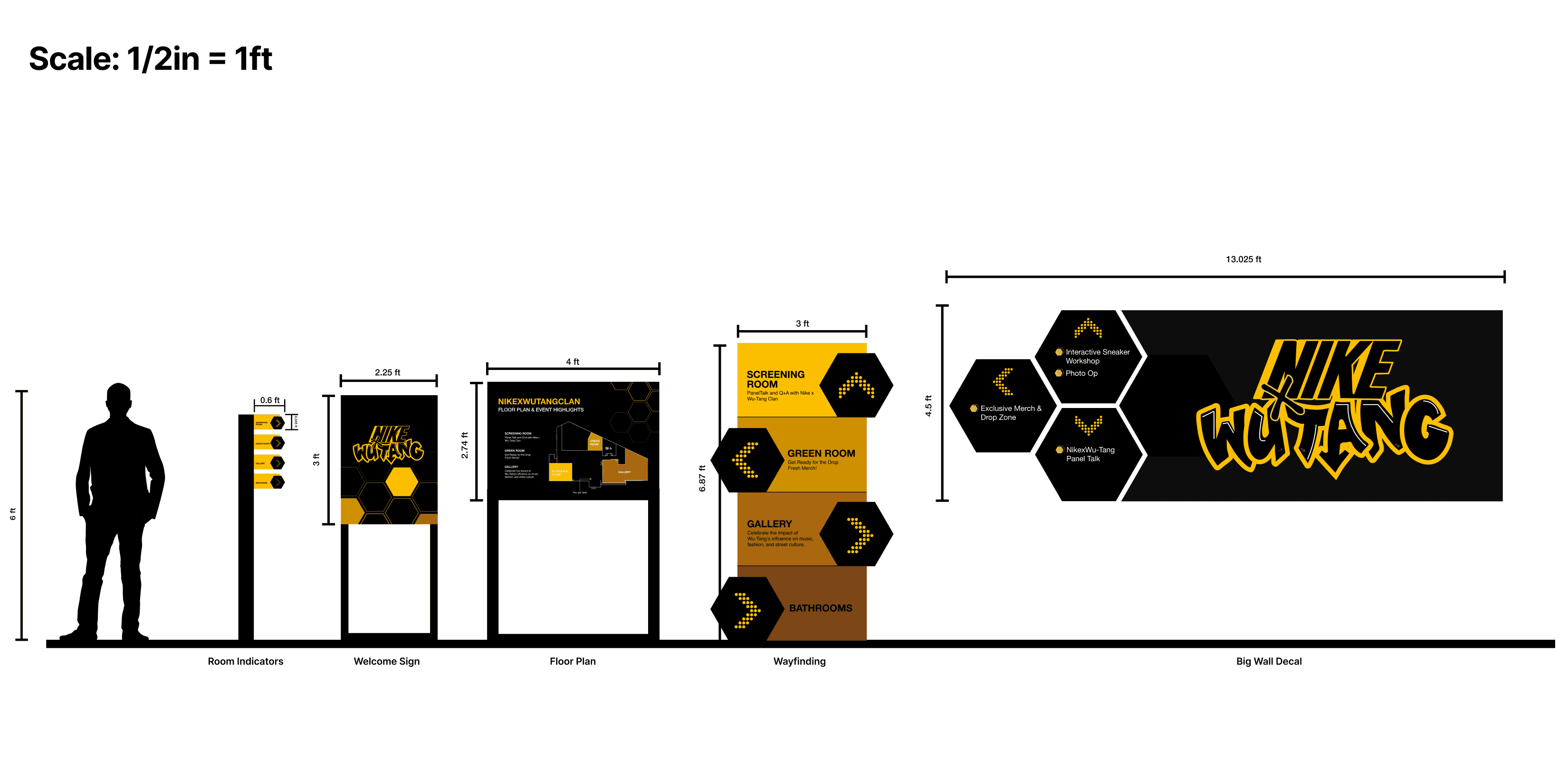
FULL SIGNAGE SCALE SYSTEM
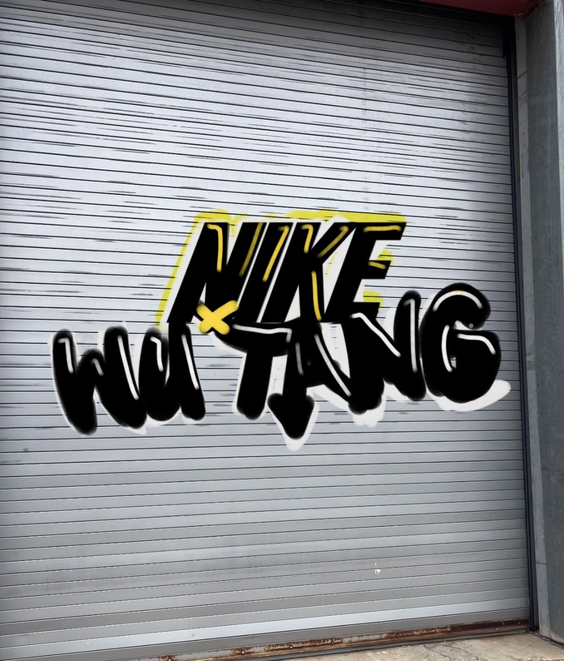
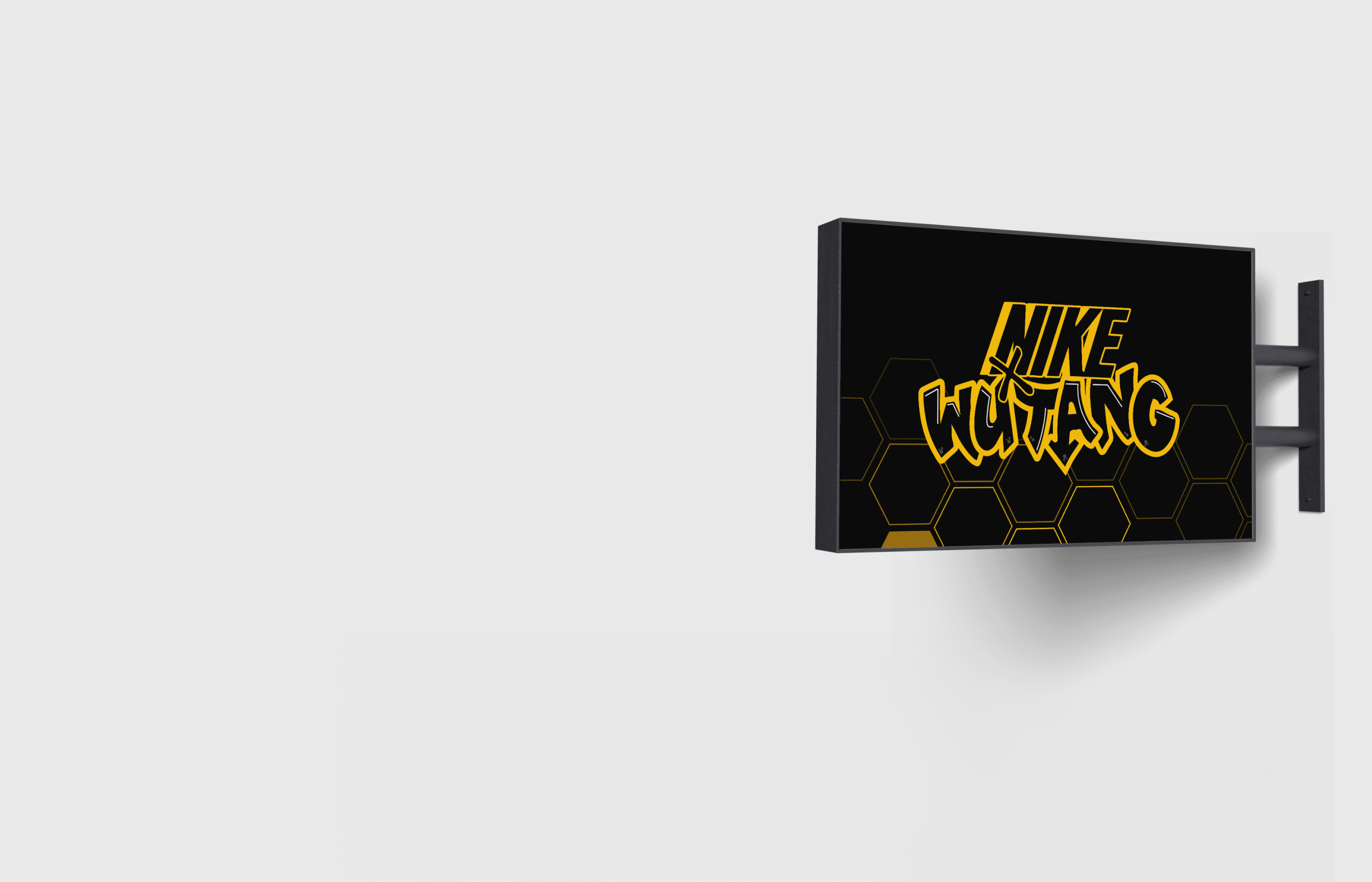
LOGO

The Mixology logo is designed inspired by makeup itself—like eye liner, lip gloss, and other cosmetic substances—giving it a experimental feel. By forming the logo out of the very materials the channel celebrates, it visually conveys the brand’s hands-on, creative, and scientific approach to makeup, highlighting its playful exploration of both art and chemistry.

COLOR PALATE

In the group, I chose the color palette for the Nike × Wu-Tang exhibition signage. We wanted to honor the “Killa Bees” theme with black and yellow while also creating a range of complementary shades to allow flexibility in the system. I selected colors that maintain a strong connection to the bee motif but are versatile enough to be used across backgrounds, typography, and accents, giving the exhibition a bold, cohesive, and energetic visual identity.
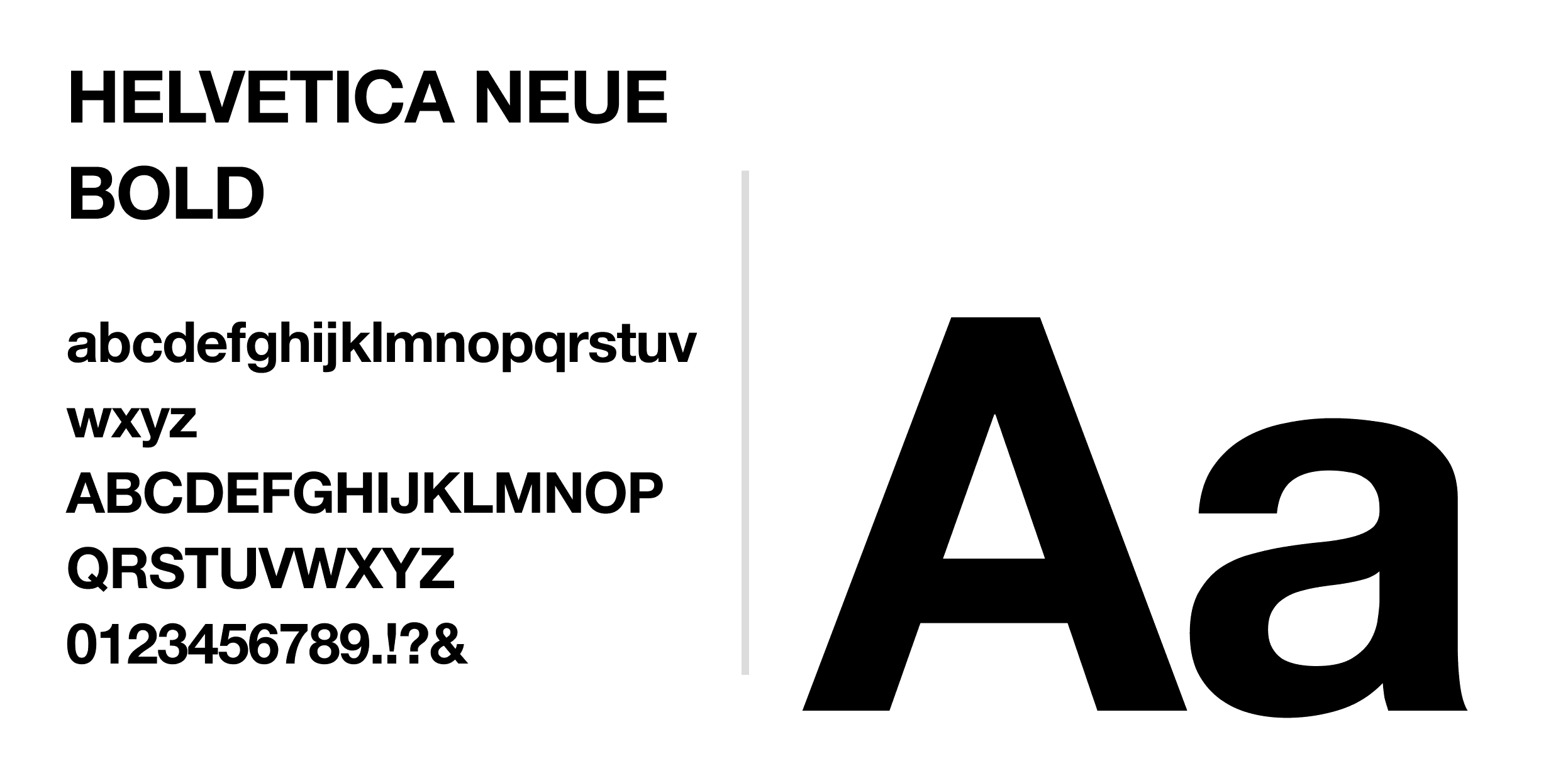
Primary Yellow

#FBD819

Honey Tan

#CB9C2B

Light Brown

#A16928

Dark Brown

#754922

Black

#000000

Primary Yellow

#FBD819

Honey Tan

#CB9C2B

Black

#000000

Light Brown

#A16928

Dark Brown

#754922

Black

#000000

TYPOGRAPHY
Heading Text:
Body Text:
BEHIND THE SCENES
BEHIND THE SCENES

I proposed the Nike × Wu-Tang collaboration for our project and suggested incorporating hexagons into the visual language to reference the “Killa Bees” theme. I sketched an initial idea that evolved into one of our primary signs, which literally breaks off into a hexagon shape, reinforcing the concept visually. When discussing the logo for the collaboration, we decided on a graffiti-inspired style to reflect the energy, attitude, and streetwear roots of Wu-Tang. I volunteered to create the logo since I have experience with creating typography, sketching it first in Procreate and then vectorizing it, which ultimately became the official logo for the project.

This project was one of my first group experiences in school and taught me a lot about communicating my ideas effectively to others. I proposed the Nike × Wu-Tang collaboration for our project and generated ideas quickly, which was exciting but also challenged me to articulate my thinking clearly so the team could understand and contribute. I also learned how to translate ideas into a cohesive visual system, creating signage that worked together consistently while maintaining flexibility. Overall, it was a fun and valuable experience in collaboration, creative problem-solving, and design system thinking.

TAKEAWAYS

This project was one of my first group experiences in design school and taught me a lot about communicating my ideas effectively to others. I proposed the Nike × Wu-Tang collaboration for our project and generated ideas quickly, which was exciting but also challenged me to articulate my thinking clearly so the team could understand and contribute. I also learned how to translate ideas into a cohesive visual system, creating signage that worked together consistently while maintaining flexibility. Overall, it was a fun and valuable experience in collaboration, creative problem-solving, and design system thinking.

Mixology was my first motion project, and it taught me how to bring a brand to life through movement. Experimenting with animation, bold colors, and dynamic shapes helped me understand how motion can enhance storytelling, convey energy, and express a brand’s playful, experimental personality. It also taught me how to merge two distinct ideas to create a unique, cohesive category — blending science and makeup into a fresh visual identity. It was a valuable experience in combining design, animation, and concept into a cohesive, engaging visual identity.

This project was one of my first group experiences in school and taught me a lot about communicating my ideas effectively to others. I proposed the Nike × Wu-Tang collaboration for our project and generated ideas quickly, which was exciting but also challenged me to articulate my thinking clearly so the team could understand and contribute. I also learned how to translate ideas into a cohesive visual system, creating signage that worked together consistently while maintaining flexibility. Overall, it was a fun and valuable experience in collaboration, creative problem-solving, and design system thinking.

ROCK SCHOOL OF DANCE

PLEASE TOUCH MUSEUM

PLEASE TOUCH MUSEUM